Bring Back the Vintage: Designing a Classic Letterpress Poster
In the ever-evolving world of digital art, sometimes the charm of vintage craftsmanship is just what you need to make your work stand out. This tutorial is here to quench that nostalgia thirst while also sharpening your Photoshop skills. Today, we’ll guide you through creating a classic letterpress poster, reminiscent of those crafted by iconic printing companies like Hatch Show Print. Whether you’re making gig posters, wedding invitations, or simply want to jazz up your wall decor, the timeless feel of letterpress can bring your designs to life.
Setting Up Your Vintage Canvas
Before pressing Ctrl+Alt+Del on modernity, your first step is to lay the foundation. Begin by opening a new Photoshop file, your digital canvas. The goal here is to replicate those subtle textures and colors that make letterpress so unique.
Start by utilizing a layered approach to create a background that will mimic paper. In Photoshop, this involves adding textures like stained paper and letterpress ink—these are the bits that whisper vintage authenticity to your subconscious. Set your bottom layer color to a delightful #FFDB00 using Inner Glow with a hundred percent opacity for that subtle pop of background color.
Texturing Time: Making It Real
Once your luminous background is ready, drumroll please—it’s texture time! Make the texture layer visible and adjust the blend mode to “screen” to overlay the grainy details impeccably. A Foreshadowing adjustment to levels will ensure only the background layer is touched, creating depth and volume in your poster.
Transforming Photos into Art
It’s time to focus on your poster’s central figure or graphical piece. Start by selecting an image that will capture your message, experience, or aesthetic. After opening your chosen photo, convert it to a smart object. This ensures that any changes are non-destructive, and adjustments can be easily revisited.
Disco-Filtering: The Right Photo Touch
In replicating the sprinkled ink dots characteristic of letterpress, navigate to the ‘Filter Gallery’ and select ‘Halftone Pattern’ from the ‘Sketch’ folder. The ideal pattern type here is ‘Dot’ with specific size and contrast settings (size: 2, contrast: 3). Adjust these settings to transform your image, casting it into the letterpress art style hall of fame.
Further tweaks can be made using ‘Levels’ to brighten the image to your liking, creating that perfect high-contrast effect distinctive in old-school printing.
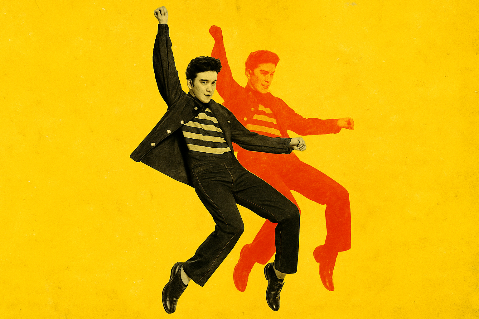
Layering Like a Pro
Here’s where things get visually thrilling: create multiple colored layers of your image to echo that retro vibe where edges aren’t perfectly aligned, a technique used in traditional mass-market posters. Copy the subject layers, apply different bold colors, and play around with their placements by using transform options. Each layer is then blended using the “Screen” mode.
Getting That Overlapping Groove
If you’ve gone through life blissfully unaware of how posters can overlap colors, welcome to your new obsession. This design trick involves offsetting your layers—imagine pushing the film rolls out of alignment in a camera. Pressing the arrow keys after making the selection gradually shifts your layers to carefully overlap different hues, achieving a pleasantly imperfect look.
Grouping & Organizing for Victory
When roomlessness becomes less a metaphor and more of a reality, it helps to tidy up the layers. Group them—because who doesn’t love a clean layers panel? Plus, when all subject layers are in their respective folders, modifying them to further custom tastes becomes a blissful task rather than a chaotic scrolling process.
Align the blend mode to ‘Multiply’ in the folder settings to texturize the entire ensemble at once. Utilize clipping masks to keep your textures in check, and manipulate your texture layer as needed to remove any unplanned bright patches from your subject.
What’s Next? Text and Aging the Poster
At this point, your vintage marvel is nearly done. What’s left is breathing life through compelling text and graphics, combined with those forgiving aged finishes that tell stories of decades past. In part two, your creative journey will wind through adding typographic elements, tasteful graphic inserts, and the pièce de résistance, those weathered creases and spots that sell authenticity like a seasoned raconteur.
Once you complete your masterpiece, revel in the feeling of conquering digital nostalgia and possibly, even hearing the whispers of poster-connoisseurs past giving you a nod of approval. Create on, my friends, and welcome these vintage wonders into your design arsenal.