Reviving the Classic Art of Letterpress in the Digital Age
So, you’ve ventured into the mystical world of Photoshop, and now you’re itching to create something that screams vintage elegance—a classic letterpress poster! Well, buckle up because we’re diving deep into part two of this retro design journey, enhancing your text with some stylish and colorful flair.
Choosing Your Typeface: The Backbone of Letterpress
Letterpress has a ton of charm, and choosing the right typeface is integral to nailing the look. Let’s kick this off with the Horizontal Type Tool—your gateway to text magic. Whether you’re aiming for “bold and loud” or “elegant and understated,” the right font choice will set the mood.
First, pop open your trusty Horizontal Type Tool and take a leisurely stroll through your font library. I’m leaning towards Great Lakes NF regular for a splash of nostalgia. Fear not, fellow font junkies! I’ve graciously linked to the fonts I adore, so you can snag them too if they tickle your creative fancy.
Fine-Tuning Your Text
The game here is all about positioning and sizing. Once you’ve settled on a typeface, go ahead and type your text directly into your document. Tweak it to your heart’s content with a quick resize using the Transform Tool (Ctrl or Command + T). If you prefer a different font for another word, simply select a new area with your Move Tool and repeat the process.
Here’s a neat trick: instead of jumping back and forth in your Layers panel, check the Auto-Select option. It’s a dream for selecting elements with a mere click. Zoom in if you must, to adjust your text until it’s perfect.
All About That Layer Organization
Let’s corral your text layers into one cohesive group by creating a folder, because if Photoshop had a middle name, it’d be “Organization.” Name this folder “Text” because originality is overrated, and we’ve got design magic to make.
Looking to amp up your text game? Drag a texture layer copy to shadow your text folder, using the Blend Mode “Multiply.” This creates an irresistible depth, making that background pop through your text just enough to boost interest without overwhelming simplicity.
Add Colorful Bars Like a Bow Tie on Top
What’s letterpress without some vibrant accents? Let’s throw in colorful bars both above and below your text by cranking up the Rectangular Marquee Tool. Go on, we trust your exquisite color taste. Reposition the bar under the text, and if you’re feeling extra, make an identical twin to hover above.
Better yet, apply a tantalizing splash of texture by clipping a texture layer over these bars. All that’s left is christening this wonder as “Bars,” and suddenly, your work is polished and pro.
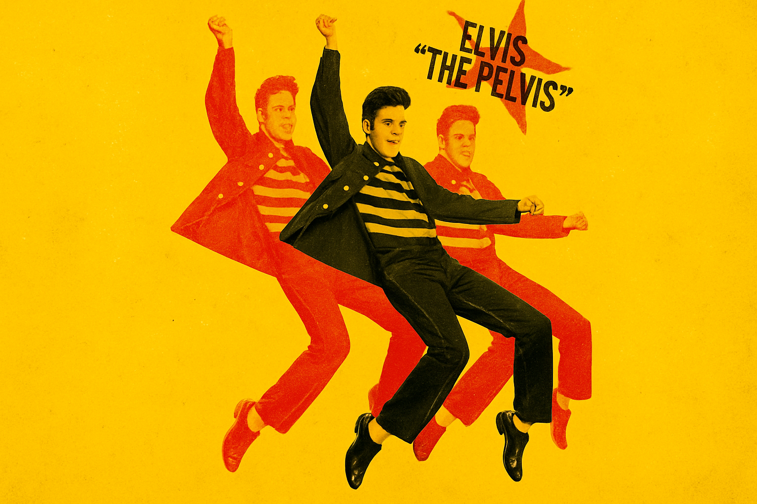
Starry Twinkle with Off-Registered Text
Onto the grand finale! Time to showcase your off-registration skills using some freeform creativity. After crafting angled text with all the dramatic flair Photoshop allows, nestle it atop a star. This attention-stealer is the patriotic flourish your letterpress poster was begging for.
Creating a Star
Position your star perfectly with Alt (or Option for Mac users) playing sidekick, and use the Make Mask magic wand. Now, move this celestial object to enforce your text’s supremacy.
Wrapping It Up: The Vintage Aesthetic
Once the colors, textures, and text are aligned, export your masterpiece and let the world bask in its retro beauty. If this classic aesthetic captured your heart, stay tuned for more tutorials that merge vintage charm with digital prowess. Our journey honors tradition while wielding digital tools—because who doesn’t love a good blast from the past when it comes to design?
And there you have it! Armed with these tips and tricks, you’re ready to bestow old-school finesse upon your creations. Go forth and let Photoshop help your art echo the nostalgia of times gone by, all through the captivating lens of the letterpress.