Unleash the Beat: Designing a DJ Dance Club Poster
Hey there, creative explorers! Ready to amp up your poster game? Whether you’re a seasoned designer or just stepping into the vast world of graphic design, crafting a vibrant and high-energy DJ dance club poster might just be your perfect next project. Why? Because there’s something irresistibly magnetic about combining visuals and vibes to create art that pulls people to the dance floor!
Straight From The Top: Set Your Stage
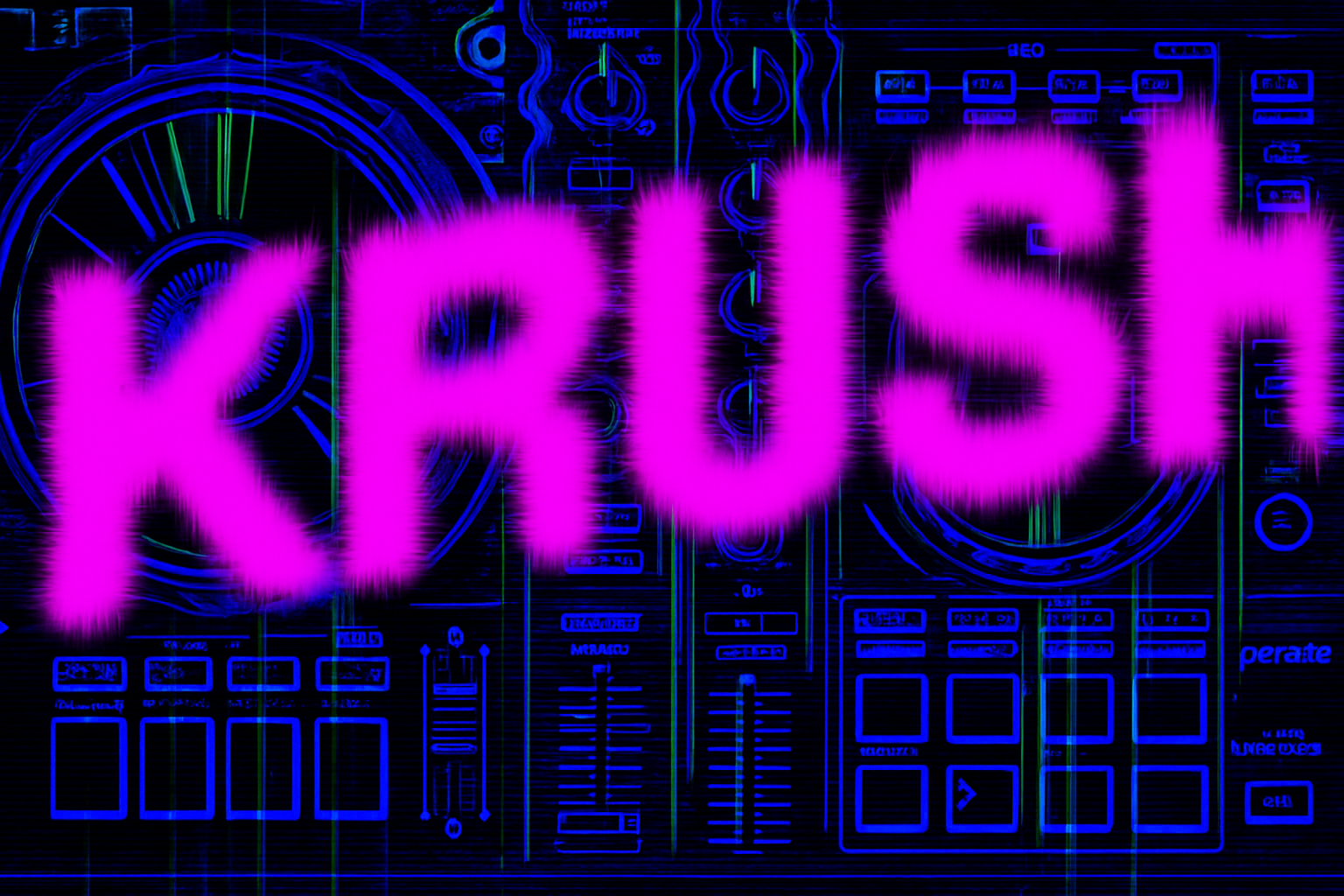
Let’s start by laying the foundation of our poster. Your background should resonate with the high-energy theme—perhaps a striking aerial shot of a DJ controller to establish that immersive club ambiance. Marty provides a stellar DJ controller image, but feel free to bring your creative flair into play. Just remember, an overhead photo mimics the top-down view of music mastery, giving your poster an authentic touch.
Once your image is set, make your foreground and background colors pop by setting them to white and black. This simple tweak brings focus and depth to your design. Next, transform your background into a Smart Object for non-destructive editing—that’s a pro move every designer should have up their sleeve.
Crafting With Smart Objects
Smart Objects are like the secret backroom of Adobe Photoshop—unleash their potential and you’ll be empowered to edit and re-edit without losing original quality. By converting your background to a Smart Object, you’re safeguarding your work, allowing you to experiment with aplomb.
Create a new layer below it, fill it with black (conveniently your background color), then apply the Photocopy filter from the Filter Gallery. Adjust your Detail and Darkness sliders to taste. Here, we recommend a Detail of 24 and a Darkness of 5 for a fine balance between mood and clarity.
Color Overlays: More Than Meets The Eye
Time to inject some color! Navigate to the “fx” icon and select “Color Overlay.” Choose a deep, rich hue—one that conveys energy and intensity. A pro tip: choose a color that complements the lighting of dancefloors. For this tutorial, the neon intensity of color code 1A00FF is the chosen shade. Set your Blend Mode to “Darker Color” for a subtle yet effective overlay that melds beautifully with your background.
Dial Up the Contrast
To add more dimension, apply a Brightness/Contrast adjustment layer. Max out the contrast—it might seem bold, but trust us, this will punch up your visuals, making them leap from the page. As you toggle this adjustment, appreciate the striking definition it grants your high-energy composition.
Bringing Words to Life
Now, let’s talk typography—a pivotal aspect of your design narrative. Choose fonts that scream excitement and movement. For instance, “Aldo the Apache Regular” breathes life into your headline text. Adjust the size to fit your layout, set crisp (Sharp) and Center Alignment, and begin painting your words across the canvas.
Create Dynamic Text Effects
Rich visuals call for dynamic text effects. Convert your headline to a Smart Object, apply a “Color Overlay” with the vibrant shade EA00FF, then dive into some blur wizardry with Motion Blur. A subtle tilt of minus 50 to minus 80 degrees with a distance between 45 to 50 pixels can produce enchanting motion effects.
Get wavy with the Wave Distortion filter. Crank those Generators up and keep the Wavelength and Amplitude low—perhaps a 1 and 3, respectively. Remember, it’s about balancing the chaos with artistry.
Secondary Text: Silent Showstopper
Secondary text shouldn’t play second fiddle. Opt for unique choices like the “Barcode Font Regular.” Color it with a matching coral hue—subtle yet energetic. Drop its opacity to 30% for an understated chic vibe, and position it snugly behind your main text.
Finally, channel your inner organizer by grouping elements logically. Name each group appropriately—this habit will save you tons of scrolling and searching down the line!
Venue Deets: The Practical Pulse
Reflect practicality with your venue details. “Dense Regular” offers clear readability, while left-aligned white text ensures essential information grabs the reader’s eye amid the visual storm of neon and motion.
Re-position your elements, group them for efficient management, and bring everything together.
Adding Dimension with Blur & ZigZag
Complete your design by applying finishing touches to your exported text Smart Object—the more dramatic the blur, the more depth you’ll communicate. Lean into the ZigZag distortion to introduce organic, circular undulations in your design.
| Blend Mode | Use |
|---|---|
| Darker Color | To subtly merge color overlays with background. |
| Opacity | Lowering it can provide depth and layering. |
Smart Object Flexibility
In design, having a flexible approach is a superpower. If you ever want to modify elements — like reducing details in medium tones — you can do so in mere moments thanks to your reliance on Smart Objects throughout the workflow. Your creativity is limited only by the bounds of your imagination.
With your DJ dance club poster ready to print, you’ve not only mastered a new design but infused your work with the pulsing energy of music and light. Onward to your next creative conquest!
Remember, creativity thrives in experimentation. Until our next artistic adventure!