Turn Back Time with Vintage Glamour
The Roaring Twenties were a time of decadent parties, bold design, and a whole lot of jazz. What better way to pay homage to this iconic era than by incorporating those rich visual styles into your digital artwork? By utilizing Adobe Photoshop, you can easily transport text back to the Jazz Age with an Art Deco twist—complete with bold lines and geometric patterns.
And the best part? This tutorial will walk you through creating a 1920s-style jazz text effect from scratch, so you can look at those Gatsby-esque designs without feeling F. Scott envious. Check out our video tutorial to see the magic unfold.
Setting the Stage for Art Deco Splendor
To get started, create a new document in Photoshop. You’ll want to set the dimensions to 1280×720 pixels at a resolution of 150 pixels per inch. This size is perfect for creating a design that emulates the opulence and grandeur of the 1920s.
Pro Tip: To quickly fit your new document to your screen, press Control + 0 on a PC or Command + 0 on a Mac.
Typeface Elegance: Choosing the Right Font
The lifeblood of any Art Deco design is in its typeface. Go for a classic Art Deco font like “Herold Square,” which you can find linked in various font libraries. If Herold Square isn’t your cup of tea, a quick internet search for “Art Deco fonts” will present you with plenty of alternatives, many free for personal use.
- Font Size: Make the top line 200 points for that bold statement.
- Alignment & Color: Smooth left alignment and a black font color will keep things polished.
Layering the Design: Bars and Beyond
Next, you’ll create the black bars that add sophistication to the design. Using the rectangular marquee tool, drag a selection over the text line’s thickness, then fill it with black.
After creating new layers, you can elongate the bars using the Transform Tool (Control or Command + T). Want the design to maintain its class? Align these bars with the text edges, preserving that sleek, unified appearance.
Text Maneuvers: Align and Adjust
Align your second line of text to match the bottom bars, ensuring that everything looks cohesive. Adjust the spacing between characters by selecting them individually and pressing Alt or Option along with the left arrow key. This fine-tuning offers an intimately detailed look—a hallmark of Art Deco artistry.
Art Deco Text Effects: Channeling the Glam
With your text layers in place, channel your inner designer to give them a textured, layered effect that screams Jazz Age elegance. Inspired by our video tutorial, you’ll use:
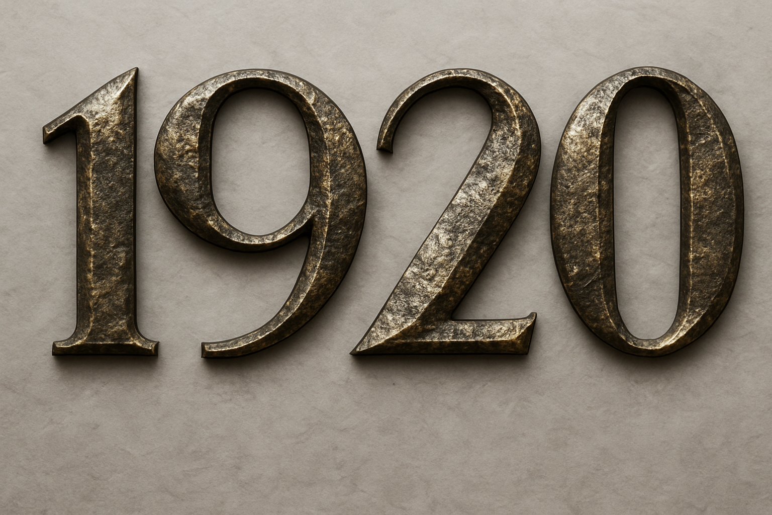
- Bevel & Emboss: Set these to Inner Bevel with “Chisel Hard” for robust depth. Adjust the size to approximately 111 pixels to match text thickness.
- Pattern Overlay & Drop Shadow: Using a “Rock Pattern” adds a rough, retro touch, while varied shadow opacity gives 3D grandeur.
Marble Swirl Background: A Dazzling Finish
The backdrop is just as important as the text itself. Opt for a swirling marble pattern, setting the stage for your grand text. Distorting the pattern with a wave filter—trust us, it’s like digital sorcery—adds that dynamic flair. Finish with a soft, dark vignette to edge your design in and keep everything visually contained.
Wrap It Up With Vintage Panache
There you have it—a Jazz Age masterpiece crafted in pixels yet rich with historical aplomb. Not only do these techniques equip you with Photoshop prowess, they let you indulge in a bit of decorative nostalgia, perfect for posters, invitations, or just impressing your equally art-savvy peers.
Feel free to revisit and experiment with these techniques. Remember, in the world of digital design, as in 1920s jazz clubs, there’s always room for improvisation.
Now, go forth and channel your inner Gatsby! Remove any inhibitions, and let your creativity dance like there’s no tomorrow. Discover the full tutorial here for a step-by-step guide to this opulent and nostalgic text effect. Happy designing!