Infusing Your Designs with Vintage Metal Textured Look
Are you trying to take your typography skills to the stratosphere, all with the help of Photoshop wizardry? Well, you’re in for a treat! Today, let’s deep dive into achieving that gritty, time-eroded metal text effect that oozes character and screams uniqueness. This isn’t just another skill to add to your belt; it’s a creative journey to make your design assets stand out like never before.
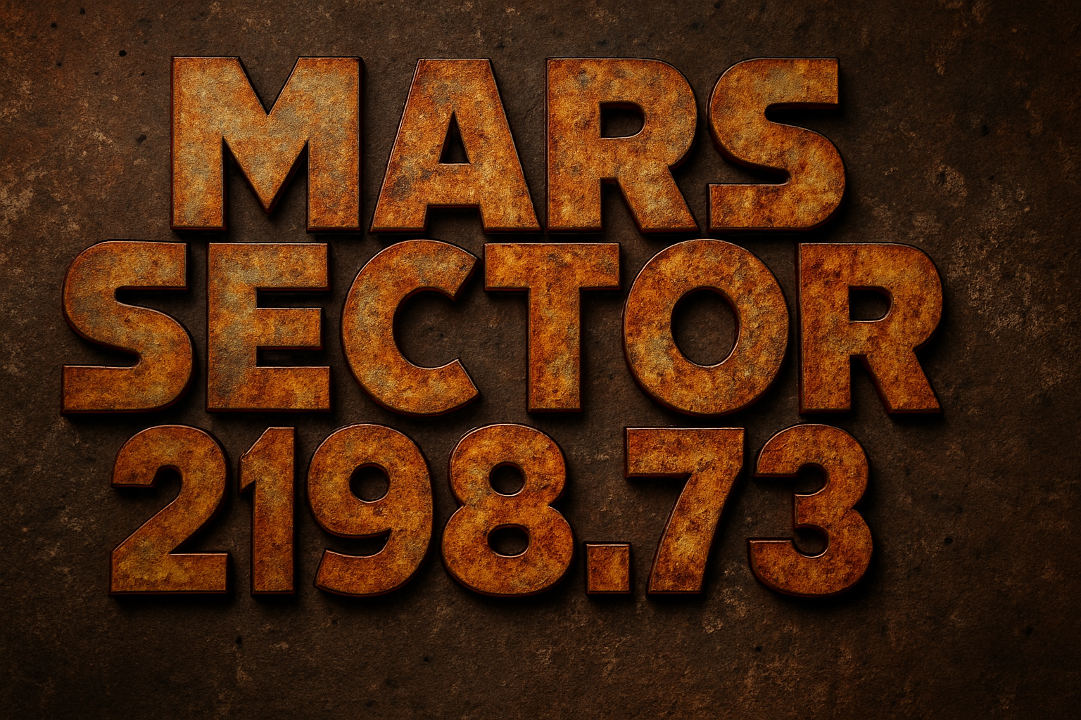
Jumping into the creative nitty-gritty, we’ll be using two specially chosen textured backgrounds to sculpt this time-worn metal text. These textures will seamlessly transform ordinary text into something that seems excavated from an ancient civilization. Imagine the blend of a dirty, rusted metal texture with a cracked concrete wall; it’s design alchemy at its finest.
The Secret Ingredients: Textured Magic
The backdrop of our masterpiece begins with a broken concrete wall. To inject it with the perfect hue, a little dab of color and leveling adjustments are in order. Finesse the wall’s color using Hue/Saturation adjustments, wherein you can fiddle with the ‘Colorize’ setting to capture that architectural relic feel.
To concoct the text itself, our chosen texture—a stalwart, rusted metal—will give the text its soul. We’ll use this as a clipping mask to fill our text layer. This not only makes the text pop but also allows us the flexibility to switch out the text without reworking the effect from scratch. Talk about efficiency!
Get Layered: Elevating Design with Layer Styles
Mastering the design involves navigating Photoshop’s Layer Style window, where options like Bevel & Emboss add dimension with their contrasting directions and chiseled effect. Inner Glow and Outer Glow are set to precise percentages to mimic light ambiance and create a moody presence. Layer effects are pivotal; they gift each text element its authenticity and presence.
You’ll also revel in the joy of using masks—imagine a layer mask as your design’s stencil, where “white reveals and black conceals” shapes the visual narrative.
An Extra Touch with Adjustments and Light Source
To bring a dash of luminosity, adding a curves adjustment layer brightens the spectrum, playing with tonal ranges that give our artwork vibrancy. Make sure to delicately drag those mid-tones and highlights until you see that extra sheen.
Moreover, adding a pseudo light source with an illustrated beam somewhere in the design morphology duplicates the drama of age-old structures revealed under cinematic lighting.
Switch It Up with Smart Objects
Oh, the magnificence of Smart Objects! These enchantments allow you to swap out text dynamically, maintaining every ounce of artistic flair with zero need to rekindle those layer styles. Simply re-enter the Smart Object to update the textual element and voilà! Magic happens—the courses stay perfectly seasoned, just with fresh text. It’s quite literally, design sorcery!
Bringing It Together
Cracking the code to create time-eroded text with that metal edge can make your project a winner! This technique offers not just a lookbook of aesthetics but the practice in control and detailing that sets your creative process a notch above the rest.
Whether you’re prepping a compelling editorial spread, crafting unique branding, or just flexing your design muscles, incorporating these detailed elements with professional finesse can transform a simple text into a narrative. Happy Photoshopping!
Remember, always take a moment to sit back and admire your work. It’s not just about applying Photoshop settings—it’s a testament to your growing design acumen and your ability to tell compelling visual stories. Enjoy the journey through layers and masks, as every click shapes a creative future!
Stay curious, creative, and above all, relentlessly innovative. Keep designing and keep discovering!