Revive the Nostalgia with Photoshop Magic
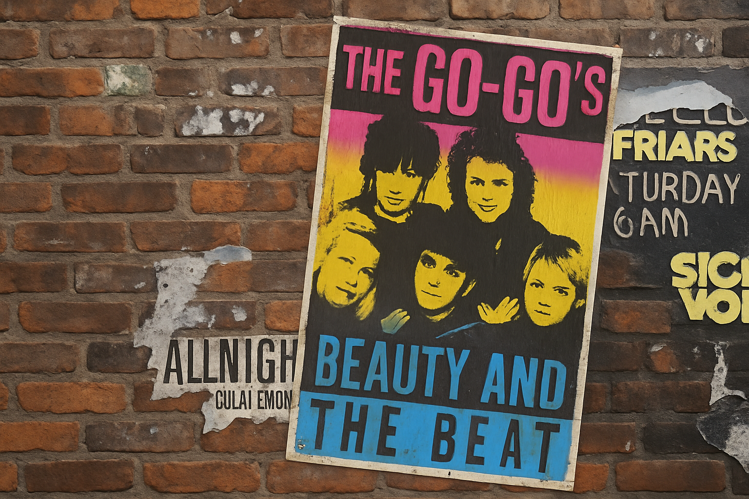
When it comes to album covers that have stood the test of time, Tom Petty’s “Full Moon Fever” is etched in the minds of music lovers worldwide. Its bold use of color and typography isn’t just a remnant of the past—it’s a timeless piece of art. Today, we’re diving into a Photoshop tutorial that will guide you through the process of recreating this iconic aesthetic, giving your own photos that perfect retro touch. Whether you’re a seasoned graphic designer or just a curious creative soul, stick around and let’s channel some vintage vibes into your digital artistry!
Setting the Stage: Gradient Background
The foundation of our retro poster lies in the gradient background. This isn’t just any gradient—it’s a tribute to the visual appeal of the “Full Moon Fever.” Here’s how you create the magic:
- Unlock your background layer by clicking the lock icon—open up the possibilities!
- Open the Layer Style window by double-clicking an empty area of your layer. Hit “Gradient Overlay.”
- Ensure your Gradient Overlay settings are just right: Blend Mode set to Normal, Opacity to 100%, Style to Linear, a cool 90-degree Angle, and Scale at 100%.
- Create a colorful transition by typing in the hexadecimal codes in the Gradient Editor: Start with 418EB8, follow it with D2BD26, and finish with BD6285.
Clicking into Focus: Image Preparations
Before diving headlong into the crafting of your poster, selecting the right image is essential. You can use any photo, whether in color or monochrome—variety is the spice of life after all! Removing the background allows the focal point to shine, which is just what you need for that vintage album cover vibe:
- Remove the background efficiently by unlocking your image layer and using the ‘Remove Background’ feature in Photoshop’s Properties panel.
- Convert your image into a Smart Object to safeguard your edits, opening doors to non-destructive modifications.
Adding that Retro Edge: Posterize Your Image
To truly capture that nostalgic feel, we’ll utilize the “Posterize” adjustment. This effect reduces the number of colors in an image, mimicking the simple palettes of classic posters:
- Under the Image menu, select Adjustments and then Posterize. Set your Levels to 2. This limits your image to pure blacks and whites, adding stark contrast.
Layer it Up: Text and Border Creation
No poster is complete without some snazzy text. It should boldly echo the spirit of the time, just like the album your design is inspired by. Here’s how you make text and border pop:
- Convert text to shapes by CTRL-clicking the layer’s thumbnail after typing out your lines.
- Ensure your top text has enough space for the border you’ll add—it frames your composition.
- For that rustic feel, hit up the Layer Style menu to add textures and strokes that echo the rough and edgy print textures of yesteryears.
Textures and Finishing Touches
It’s all about the details! Once your core elements are set, adding the grain texture and subtle stroke lines will finalize the intrigue and aesthetic vibe:
- Use Filter > Texture > Grain to apply a rough texture reminiscent of vintage print. With Intensity at 15 and choosing “Enlarged” grain type, your design will scream classic chic.
- For the final border, make use of the Stroke parameter. Experiment with Blend Modes and Opacity to see which styles invoke a sense of nostalgia!
Creating a retro poster inspired by the “Full Moon Fever” album is a joyful foray into design exploration, allowing you to imbue personal projects with an air of vintage charm. Plus, it’s an amazing skill to add to your creative repertoire. Embrace the retro vibes and let your designs time travel into the glory days of bold album art. Happy creating!