Create Your Own Iconic Newspaper Front Page
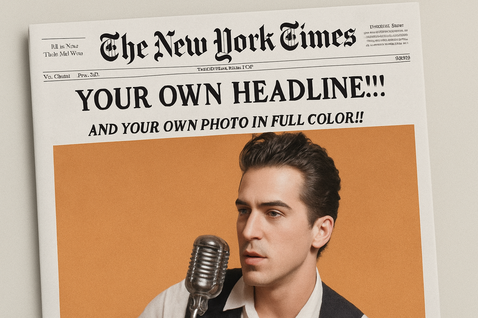
Ever wanted to see your face plastered across The New York Times? Okay, maybe not literally, but at least in a quirky, Photoshop-fun kind of way. This article takes you on a creative journey to make your own custom front page of “The New York Times,” complete with your chosen photo, right from the comfort of your design software. Surprisingly simple and delightfully satisfying, this project is perfect for those posterity portraits or, let’s be honest, those playful jabs at your celebrity crushes.
Gather Your Tools
Before diving into customization, ensure you’ve downloaded everything you need. Grab the provided template and necessary fonts ready with placeholders for headlines, dates, and photo captions, linked conveniently within the video’s project files. This setup minimizes the fuss and positions everything perfectly, ensuring your masterpiece looks newspaper-ready!
Photo Processing Like a Pro
Choose a vibrant photo that you wish to feature. Start by placing it onto the open template—like a seasoned pro. Ensuring it’s in the perfect position involves a little resizing magic by using the Channels panel. If not easily visible, simply open it through Window>Channels. Selecting the shape of your image with Ctrl/Cmd–click of the Alpha 1 thumbnail guides the final output. This highlights the importance of layer masks in Photoshop—they’re the non-destructive editing superheroes we didn’t know we needed.
Adjusting Images for Printing
You’ll want to adjust your photo to mimic newspaper print. Ensure the photo fits nicely within the shape to avoid awkward borders. Photos always appear darker once printed, so use the “Darken” blend mode to remove unrealistic bright spots. This neat little trick swaps light pixels for the paper’s own light tones, making the photo appear genuinely printed. Convert your image to a Smart Object—this means all filter tweaks are applied without destroying the original. Add a classic print effect by going through Filter > Noise > Add Noise, followed by Pixelate > Color Halftone. The blending mode Soft Light (60% opacity) ensures the bespatter of tones looks authentic.
Play with Contrast and Texture
Newspapers rarely deal in true black-and-white; instead, they lean heavily on grays. To simulate this, adjust the photo’s contrast with an Adjustment Layer. Clip it to keep the changes local—a nifty Photoshop tip. Lowering contrast ensures those darker shades aren’t overbearing. Sprinkling a texture over the image—’Clouds’ from the Filter menu—conveys the characteristic uneven ink for even more realism.
Refining Through Layer Manipulation
Adjust the overall vibrancy of your photo using another Adjustment Layer, manipulating color intensity to suit your mood. Remember, only the photo’s layer is affected thanks to its monochromatic neighbors. Next, replace text through the template’s text layers. Options await for each component, from the date down to the sassy little quip under the photo. Pro tip: Zoom in for clarity when working on tiny text sizes.
Finishing with a Flourish
All that’s left is to tie it together with a slight blur. Filter > Blur > Gaussian Blur lightly softens those text edges, letting them integrate seamlessly onto the print. Enhance that ‘just printed’ charm with one last Layer Adjustment. With Levels, this controls the tone values. Highlighting the black tones to a softer shade achieves a polished, final touch that graces your entire layout.
Whether you’re crafting a humorous spoof or immortalizing a moment in pseudo-newsprint elegance, these personalized front pages let your imagination roam. Unleash this technique in scrapbooks, social media highlights, or as part of an alternative project portfolio.
Ready to make a headline splash of your own? This creative journey blends fun with mastery, illustrating how art can blend seamlessly with digital wizardry for spectacular results. And if you’d like to see the whole process in real time, be sure to check out the linked YouTube tutorial. Let those creative juices flow!