The Art of the Swiss Style: A Journey into Minimalist Design
The International Typographic Style, popularly known as the Swiss Style, is not just a relic from the bygone era of the 1920s; it’s a testament to the power of minimalist design that graces everything from modern branding to web interfaces. Born in Switzerland during the 1950s, this design approach is characterized by its asymmetric layouts, grid systems, sans-serif typefaces, and flush left, ragged right text alignment. The brilliance of Swiss Style lies in its functionality and clarity, which are beautifully encapsulated in typographic posters.
In this guide, we take a deep dive into creating a Swiss-style typographic poster that echoes the elegance and simplicity of this timeless design movement. Whether you’re a design aficionado or a Photoshop novice, here’s how you can embark on this creative journey.
Setting the Stage: Creating a New Document
Before unleashing the Helvetica spirit within you, ensure you’re working with a sizable canvas. A fresh document ensures you have ample space to experiment without sacrificing print quality. Set your measurement units to inches and consider starting with a width of 20 inches, a height of 12 inches, and a resolution of 300 pixels per inch. Opt for an RGB color mode and 8 bits per channel to maintain color integrity during digital previews.
Choosing Your Typeface: The Backbone of Swiss Style
Enter the realm of sans-serif fonts. Swiss Style champions typefaces that are clean, readable, and unambiguous. Consider using “Berthold Akzidenz Grotesk Bold” or its regular variant. Aim for a visually impactful size, such as 675 points, to establish a bold presence. With sharp edges and left alignment, black becomes the ideal color foundation for your typographic artistry.
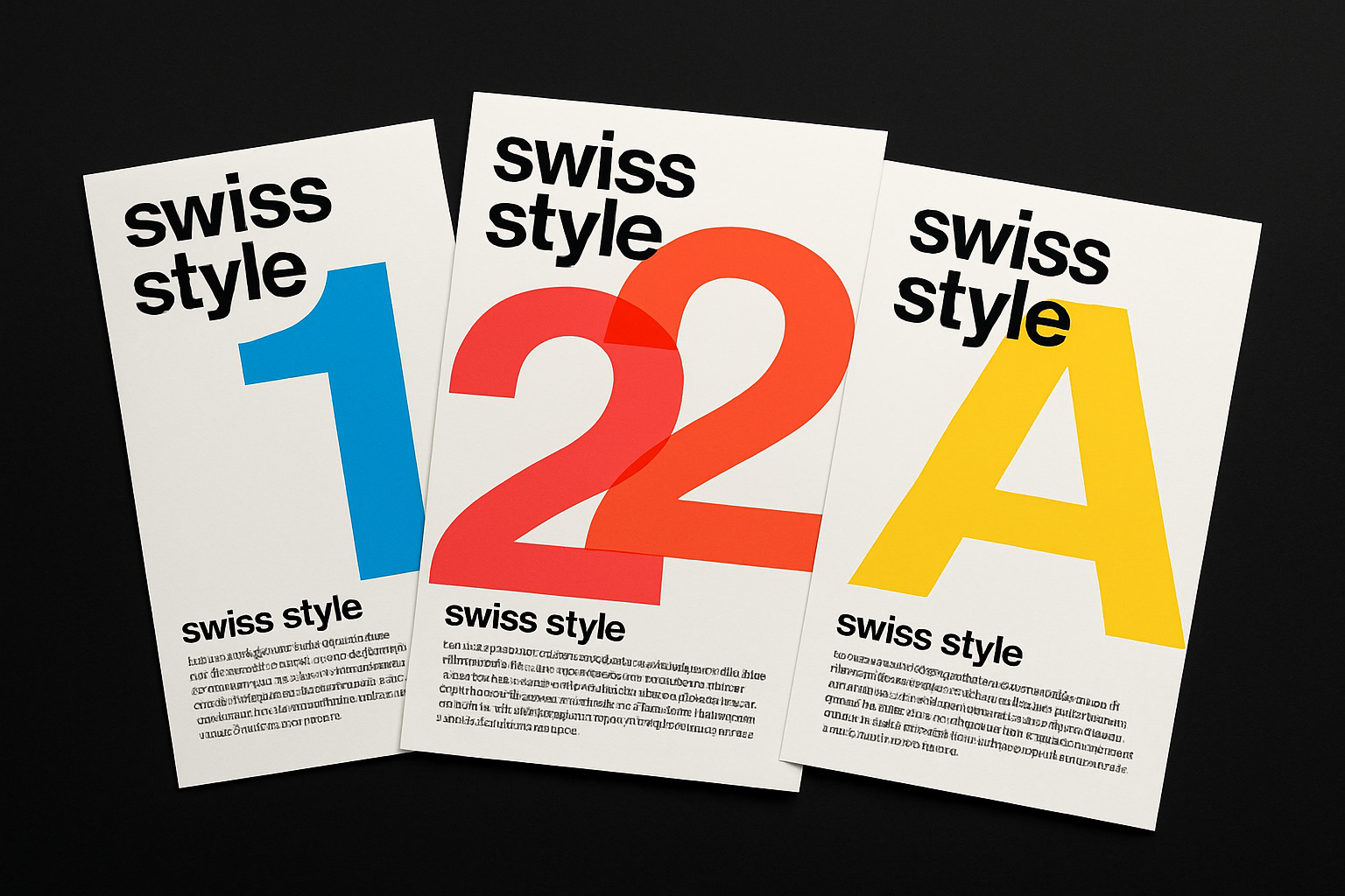
Crafting Letters: Playing with Overlaps and Colors
Each character contributes to your poster’s visual rhythm. Begin by typing out your first character, adjusting its placement so it hugs the top of your canvas, leaving room for more text. Overlapping characters isn’t just a choice—it’s a nod to the organized chaos typical of Swiss Style. Explore “Blending Options” to experiment with character colors by toggling Red, Green, and Blue channels—a playful method that lets you tweak hues with ease.
Duplicate your characters using keyboard shortcuts (Ctrl or Cmd + J), strategically aligning and overlapping them to establish your visual grid. Here, grids aren’t oppressive; they’re creative constraints that guide your design’s rhythm effortlessly.
Aligning and Arranging with Swiss Precision
It’s time to drop the letter perfect act and embrace intentional misalignment. Choose a character on your word’s left side and slide it down strategically. Select and activate characters one by one, aligning with others to maintain fluidity. Swiss-style graphics celebrate grids and alignments, so have fun experimenting with angles and placements until the ensemble resonates with your vision.
Don’t forget ruler guidelines for precision (or after that sixth cup of coffee). Drag them to align with the edges of your text for flawless cropping.
Layer It Up: Mergers and Moves
To maintain order amidst the overlapping dancing characters, move all characters into one folder within your Layers panel. Highlight them all using Shift-click commands, then unite them in harmony by pressing Ctrl or Cmd + G. Slap on a simple “t”, open your Type Tool, and let your creativity dictate font size and text positioning.
Down to the Kern: Creating Text Blocks
Clear type thrives with well-organized text blocks below the main event—create yours by drawing a text box using your Type Tool and set your font’s size as you prefer. Typographic choice is a crucial aspect; select a regular weight font and go small (around 12 points) to keep expansive visuals spotlighted.
Once your block is ready, paste or type text inside and adjust heights to ensure visibility. Confused where to cut? Swiss style puts letter perfection above all else; gently nudge elements until the ensemble screams classic.
Sealing the Deal: Adding a Colorful Graphic Bar
Don’t underestimate the power of a well-placed bar—especially one that vibes with the hues above. Create a new layer, use the Rectangular Marquee Tool to generate a base, then grab colors from existing characters using the Eyedropper Tool. Copy, transform, fill, rinse, and repeat. Select, extend, and fill with complementary colors, keeping text on top in mind.
That’s Swiss Style in a nutshell. Whether you’re churning out sleek posters, branding, or designing interfaces, this minimalist approach factors functionality into every creative choice. And best of all? It’s your own unique interpretation of an iconic style.
Here’s to creative chaos, whispered precision, and the boundless limits of typography. Now go forth and embrace the elegant chaos!