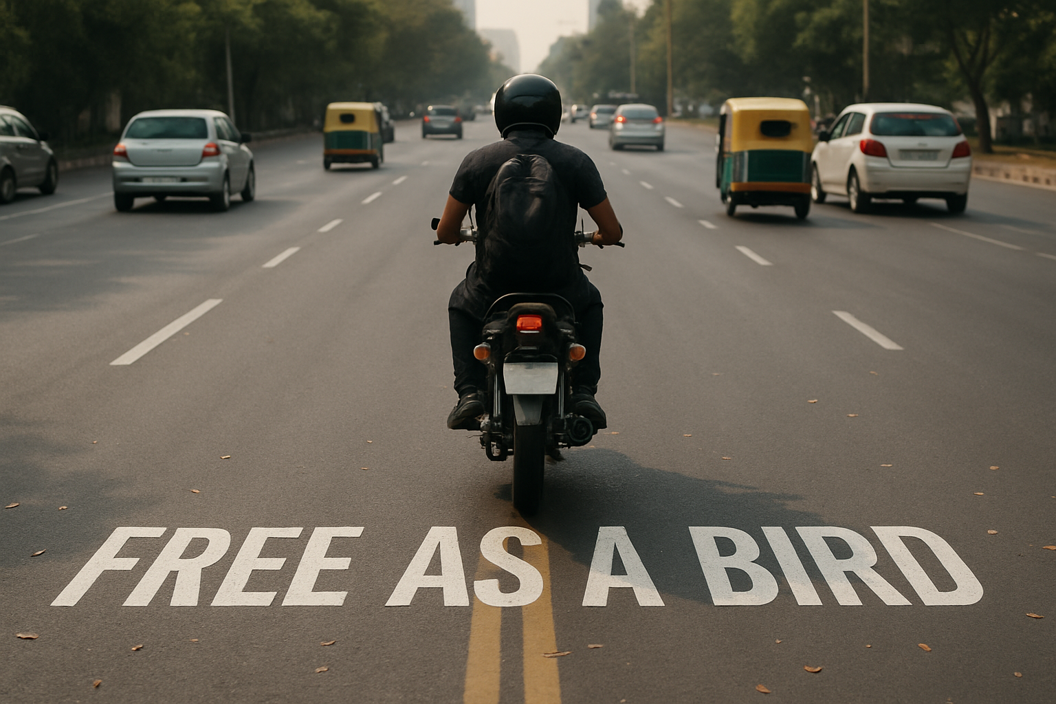
Master the Art of Road Signs with Photoshop
Everybody loves a clever road painted sign, those fanciful font creations blazing across asphalt that beg for a double-take. But did you know they’re easier to replicate than you might think? Today, we’re diving into a whimsical yet precise technique to create your own road painted signage using the mighty powers of Adobe Photoshop. Get your digital brushes ready; we’re taking inspiration from the world of road art and possibly ushering in new torrents of creativity for your next digital project.
—
The Basics: Setting the Stage for Your Sign
First off, let’s get our canvas ready. To start creating your road sign, set your document’s dimensions to 1280 by 720 pixels with a resolution of 150 pixels per inch. It’s a compact space to work wonders on and perfect for your pixel-perfectionist needs.
Next up, the quintessential tool for any text-based creation: the Type Tool. If your text box is playing hard to get, head over to the “Window” menu and select “Character” to bring those font settings down to your Photoshop mat. As for your font choice, a solid, modern sans-serif such as Le Gothic will do the trick. It’s free to download from Font Squirrel—one of the internet’s greatest font treasure troves. Pick that standard white for your text color to keep things bold and visible.
Position, Perspective, Affix
Your words on the screen won’t look like you painted them on the road yet, but we’ll get there. Activate the Move Tool to position your text, then rasterize that layer to make it a solid piece on your digital canvas. The real magic happens when you apply perspective: We want the text to look like it’s naturally lying across the road.
To bend and stretch that typeface into submission, press Control/Command + T to open the Transform Tool. It’s here where you lean on established road marks, like painted lines, to guide the angles—the kind of precision Pinterest dreams are made of. By holding down keys like Shift and Control/Command (Shift and Option on a Mac), we adjust the text until it seamlessly falls into perfect road-grade perspective.
Refinement: Size & Selection
Need that sign a little smaller? You got it: Just grab a corner, hold Shift and ALT/Option, and scale as needed. Once you’re satisfied with your scaling and placement, seal the deal by pressing Enter/Return.
Next is selection wizardry: Control/Command-click on your text layer to create a selection, activate your background layer, and peel your text from it with Control/Command + J. Need to layer stack? Raise that new layer to the top and show how savvy you are with blend modes. Switch to “Hard Light” to let the realities of road paint-tech shine through.
Finishing Touches: Blur and Blend
A crucial step in conveying realism in your design is mimicking depth of field—blurring elements according to their distance in space. The upper portions of your sign will naturally feel less focused; to replicate this gradient, turn to the Blur Tool. Use a 70-point brush with a strength of 100 to guide that fading effect. This step makes sure your text gracefully merges with the scene’s existing depth.
Taming Vibrancies
Got color overload? It’s no secret that blend modes can ramp up the saturation inside your sign. Command/Control + U swings open the Hue/Saturation window, offering a palette toning-down option ideal for subtle realism. Slide that saturation down to about 50% depending on your road template’s specific quirks, and smile as your naturally understated sign glows with genuine life.
You’ll see that constructing such a sign isn’t just about following a technical process—it’s crafting an illusion that teases and entertains. It’s all about refining the details and understanding how each step works toward convincing realism. So there you have it, an express lane from text to tarmac. Whether for fun, function, or the fulfillment of artistic wanderlust, who said signs are only for the roads?