Get Groovy with 1960s Psychedelic Rock Posters
Ah, the 1960s. A decade of tie-dye, flower power, and music that could make your parents worry about your life choices. Amidst the swirling colors and free-spirited vibes, the psychedelic rock poster emerged like a visual symphony that captured the essence of the era. Today, we’re diving into how you can create your very own 1960s-style psychedelic rock poster using Adobe Photoshop. It’s a journey back in time, filled with vibrant colors, groovy fonts, and more layers than your grandma’s best lasagna.
The Canvas is Your Playground
First things first, open up Adobe Photoshop and create a new document with dimensions 1440 by 1800 pixels at a resolution of 72 pixels per inch. This is your blank canvas—a digital playground where vibrant colors will dance wildly like they did back in the Summer of Love.
Crafting the Psych Rock Look
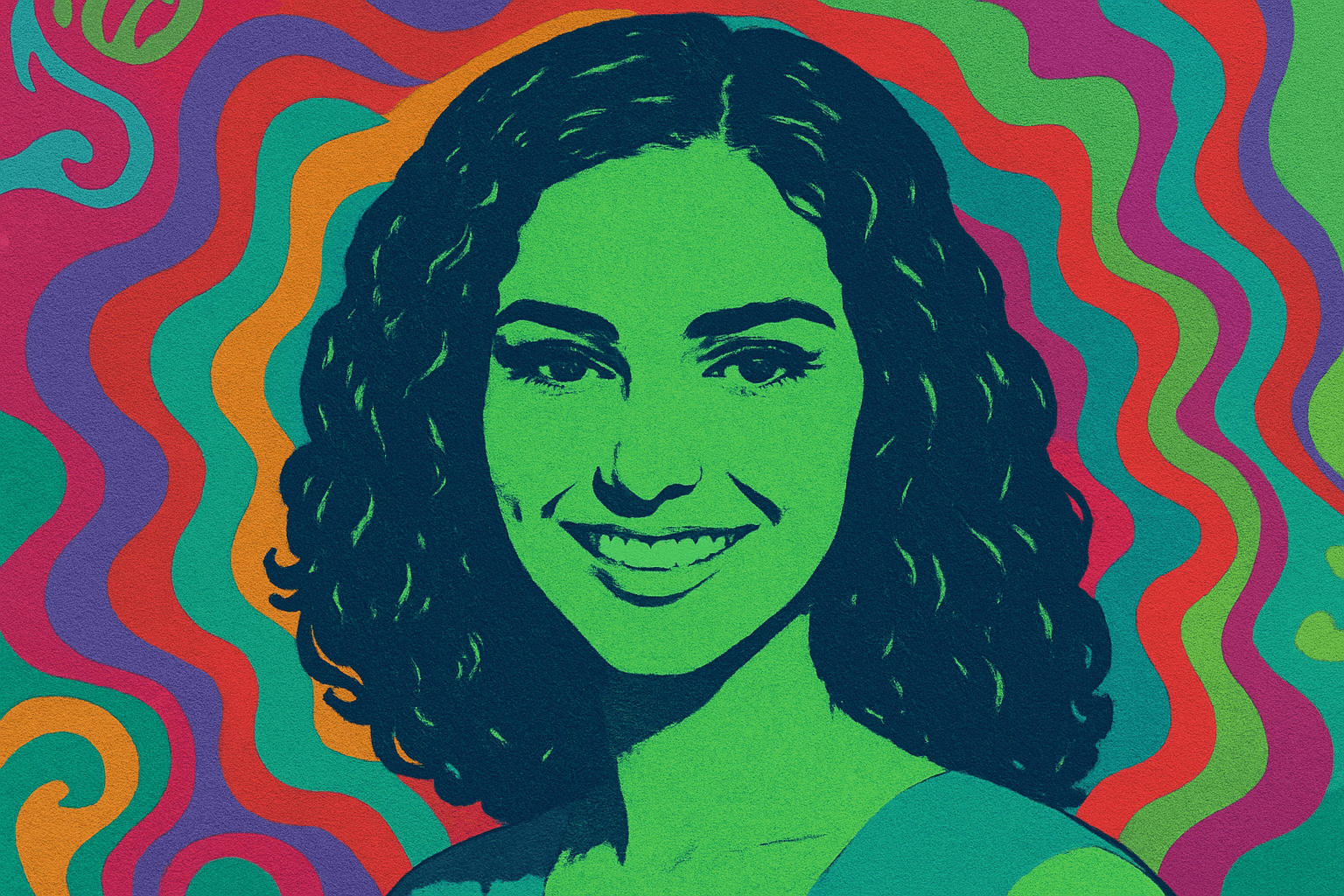
Let’s kick off with the basics and lay down our psychedelic poster foundation. Duplicate your base layer, hide the original, and prepare to dive into the realm of possibilities. The next step is to embrace the magic of the Posterize adjustment layer. With just three levels, you’ll bring out those dark, daring contrasts that are quintessentially psychedelic. Capture this vibe by blending your layers through the magic (wand) tool and by clicking on similar areas to select all whites, transforming them into a quick mask by pressing Q.
Add Some Color, Man
The 1960s weren’t known for their subtlety, and neither should your poster be. Enter the era’s obsession with eye-popping colors. Go ahead and fill your girl’s shadows layer with a bold shade of #023ec6, and give the highlights a striking #67fcb4. Whatever colors you choose, remember the psychedelic mantra: anything goes.
Feeling adventurous? The psychedelic aesthetic thrives on chance encounters and happy accidents. Try out all sorts of color overlays, gradients, and saturations. Coax different moods and energies by playing with these adjustments. Remember, in the rock scene, more was definitely more.
Text: Warping is the Name of the Game
Psychedelic posters were notorious for their trippy, often barely-legible text. No rules apply here. Open the character dialogue box, select a font that’s so out there it might just be orbiting the moon, such as “Cooper” for main text and “Bellbottom Laser” for band names—this gives your poster that authentic festival vibe.
When it comes to warping your text, think of it as clay. You’ll want to nestle words into their surroundings, letting them flow into the empty spaces. If a word overlaps a design element, good—that’s what gives it character. Fonts like “Smack Attack” and anything boasting a bell-bottom groove feel right at home here.
Unleash the Vintage Feel
What seals the deal on ensuring your poster looks fresh off the press from the Swinging Sixties? A believable texture. Vintage paper textures can be your secret weapon, downloadable for free from resources like CG Textures. Set that paper as your background, switch the blending mode to “Multiply,” and watch your poster age gracefully with that coveted vintage patina.
Final Flourishes and Finesse
There you have it. The final steps involve adding the perfect texture and adjusting the saturation to ensure the colors scream as loudly as Jimi Hendrix’s guitar solos. You may have lost yourself in hazy layers and kaleidoscopic colors, but now, after filling gaps and tweaking layers, behold your 1960s-style psychedelic rock poster.
Whether you’re planning to frame it, share it on your Insta feed, or use it as inspo to theme your next Zoom background, you’ve just channeled some serious San Francisco vibes straight onto your screen. So go enjoy the creative chaos, man.
For a more in-depth adventure into constructing your very own psychedelic masterpiece, check out our embedded video and let your inner rockstar designer shine. Happy designing!


