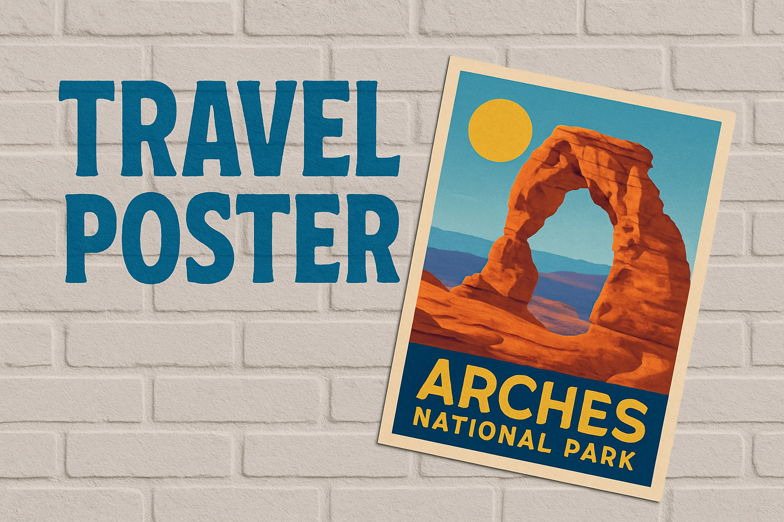
Create Stunning Designs with a Classic Twist
Once upon a time, in the not-so-distant past, the world of advertising was vibrant with colorful, hand-drawn tourism posters that captured the imagination. They were more than just marketing tools—they were works of art. Today, we’re taking a nostalgic trip back to recreate that iconic look using Photoshop. This comprehensive guide will help you design your very own retro-style tourism poster, ready to charm viewers with its vintage allure.
Step 1: Image Preparation and Correction
Your journey begins with selecting a photo worthy of your visionary poster. Open it in Photoshop and ensure it meets the standard 300 pixels per inch resolution. This is the crispy goodness that ensures your finished product looks pristine and professional. Resize it to 12 by 16 inches or whatever dimension your creative heart desires.
To kick things off, let’s auto-correct the brightness and contrast using “Curves” from the Adjustment Layer. Enhance the vibrancy like it’s a dull Saturday night, ready to become alive with color.
Step 2: Darken to Brighten
For those chic vintage aesthetics, a little drama around the text placement area makes all the difference. Enter the Gradient Tool. Applying a black-to-transparent gradient at the bottom of your image gives it depth and makes light-colored text pop beautifully. Switch the blend mode to “Soft Light” for just the right amount of mysterious allure.
Step 3: Non-Destructive Creative Editing
Time to get non-destructive! Converting your layers into a Smart Object means you can fiddle around without fear. This allows you to edit freely, knowing your original content is tucked safely away.
Head over to the Filter Gallery to filter those pixels through an old-school lens. Select the “Cutout” filter to keep textures simple yet stylized. A hint of surface blur will smooth out any rough edges, ensuring your poster is polished to nostalgic perfection.
Step 4: Inner Glow Magic
Channel some inner glow into your poster by embracing white as the hero of the hour. Craft your Inner Glow in the Layer Style menu to get that cool, celestial effect around the edges. With the source set to ‘Edge’, crank up the Choke and Size for maximum impact.
Step 5: The Sun and the Typography
No retro tourism poster is complete without a sun—after all, who wouldn’t want an eternal summer baked into their design? Using the Ellipse Tool, create a cheerful, blazing sun that lights up your poster.
Text is the storyteller in your design tale. Using a bold font like “Rockwell Condensed Regular” adds that vintage veracity. Match your text color to your sun for thematic harmony. Adjust the tracking to get the personality just right.
Need more text? A contrasting font like “CarlMarx Regular” can emphasize differentiating elements. We’re all about balancing the bold with the delicate here.
Final Touches: Centering and Shadowing
Align your text layers like a pro with the “Align Vertical Centers” tool—an unsung hero in the designer’s toolkit. Once aligned, our pièce de résistance? A shadow, of course! Select a drop shadow in the Layer Style menu, picking a shade that brings out the textures in your design.
And just like that, through the whirl of pixels, adjustments, and creative imagination, you’ve crafted a retro-style tourism poster that’s destined to beckon wanderlust and admiration. Happy designing, modern maestros of vintage magic!