Step into the world of creativity as we delve into the design of a captivating poster featuring gradient text, a beautifully edited photo, and expertly wrapped body copy. Whether you’re a Photoshop newbie or a seasoned pro, discovering how to combine these elements not only expands your skillset but sets your work apart. Let’s explore how you can achieve this aesthetic with a few of Photoshop’s versatile tools.
Setting Up the Scene
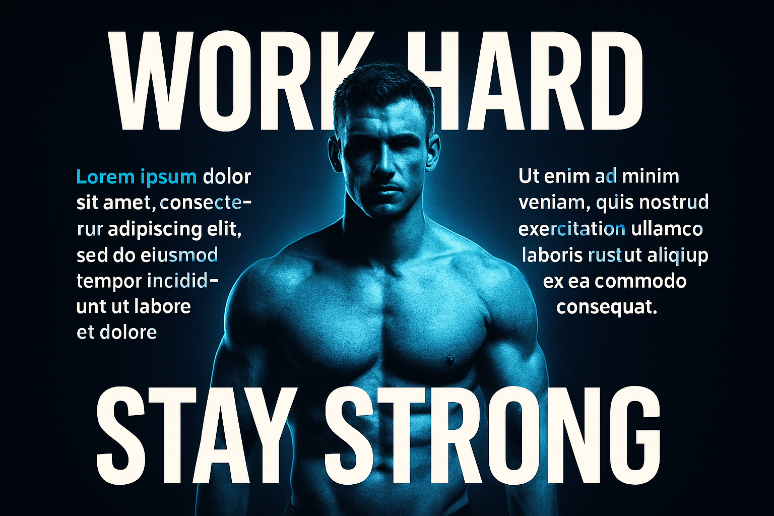
Imagine you’re about to design a poster that not only catches eyes but holds attention. A powerful visual, and compelling text wrapped elegantly around it—this is what we’re aiming for. Begin by selecting a photo, ideally of a person, that will act as the poster’s focal point. Downloading images from stock photo services like Shutterstock often provides high-quality options to work with.
Separating the Subject
Before we get to the fun parts, it’s crucial to have your subject separated from the background. Why? This gives you creative freedom to adapt and adjust your subject independent of the background. Utilize the Quick Selection Tool (a faithful and snark-free companion in many projects) to deftly outline your person of interest. Once selected, refine it using the ‘Select and Mask’ filter for the newer Photoshop warriors or ‘Refine Edge’ for those clutching tightly to older versions.
The Smart Way to Poster Design
Converting your subject to a smart object early on allows you to trial-error your creative filters without leaving a mark. Think of it as giving your work a parachute: safety to fall back upon should tragic design decisions occur. Once smart-objectified, add a fresh layer beneath your subject and fill it with a grounding black backdrop.
How? Quick tip: D is your friend for resetting those color swatches. Then, let your newfound shortcut, Alt/Option + Delete, blanket the layer in deep darkness.
We Bring Color to the Canvas
Now, the creative juices get to flowing. Start with a Hue/Saturation adjustment layer. This is where personal taste reigns supreme—pick a hue that speaks, or sings, to the design’s mood. Speedy suggestion: A celestial blue (Hue: 209, check!) makes for an ever-reliable choice, but do feel free to let your mouse run wild here.
Add the Glow That Binds Us
Harness the power of glow, because nothing screams ‘pay attention’ quite like it. Navigate yourself to the Filter Gallery, open the Distort Folder, and etch Diffuse Glow onto your image. Let your inner artist guide the glow amounts until satisfaction smiles upon you. For the extra oomph, polish off with an Outer Glow (white, full opacity) that wraps around like a designer hug.
Typography: Text That Tells A Story
You’re now staring at the type tool, and it’s staring back asking “What fonts to choose?” Consider opting for Bank Gothic Bold, a classic with clean edges ideal for gripping poster text. Size it, align it—the usual dalliance—but do so strategically. Our aim? The text should nestle comfortably near the edges of the poster, orchestrating a symmetrical splash of eye candy.
Gradient Text to Elevate
Now, for a bit of whimsy—a Gradient Overlay that gives life to your text. Pick dynamic colors, or keep it monotone, but make sure the vibrancy really pops. It’s all about that visual poetry.
Final Touches That Wow
Here’s where you shake hands with ghostly Lorem Ipsum to play placeholder, mastering text accurately wrapped around your main subject. Spotting a nowrap option, expanding selections, all these maneuverings fine-tune those final words to dance with the design coherently.
Complete the look by adjusting your paragraph settings—align, size, space—then watch as it subtly records itself in the viewer’s subconscious.
In conclusion, the dance of text and image on your poster canvas becomes an exhibition on its own. Whether using Photoshop for the first or the thousandth time, there’s a certain thrill in each gradient twist and subject extraction that makes the process worthwhile.
Happy designing!


