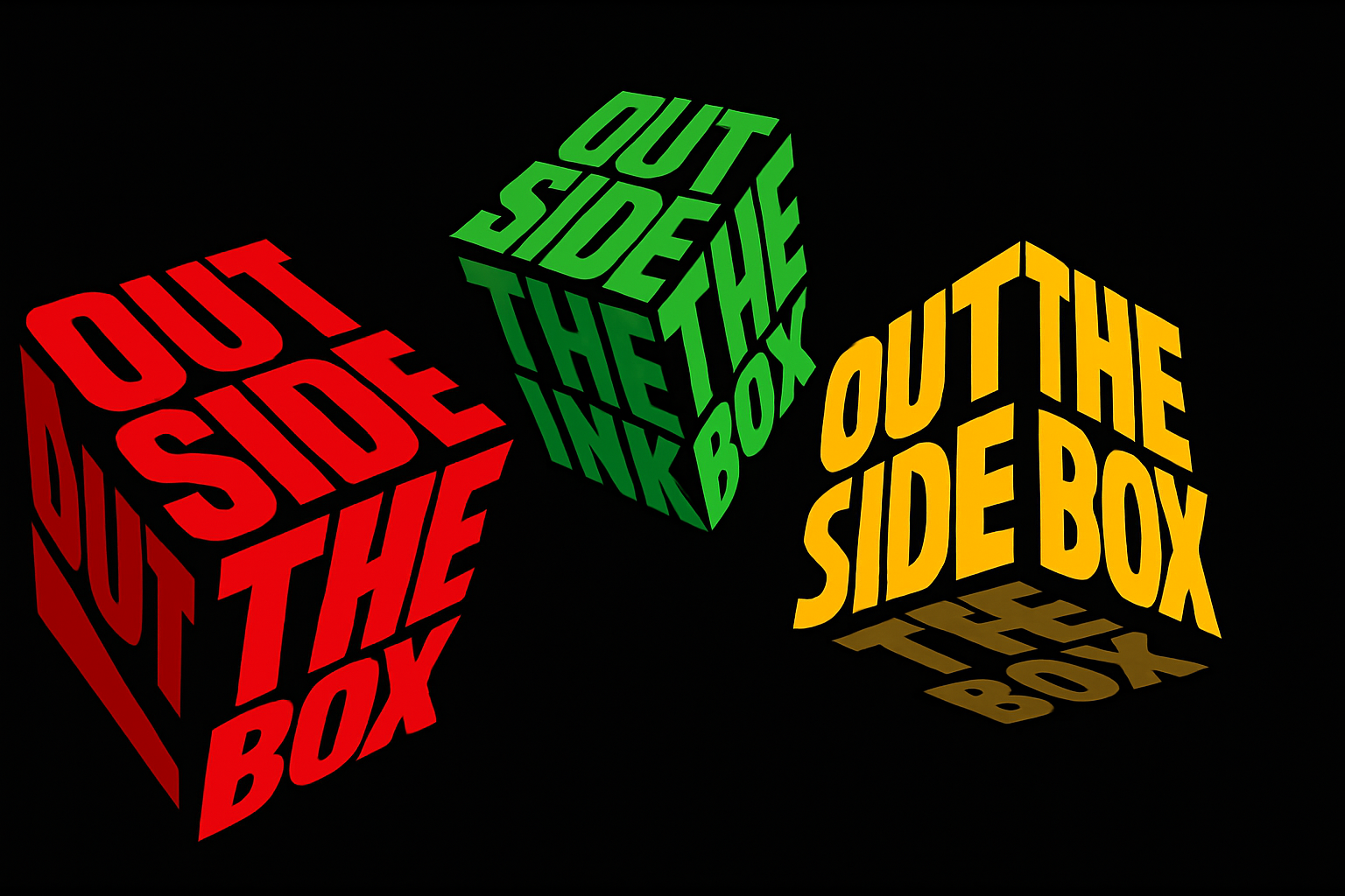
Add Depth and Dimension to Your Text Art
So, you’ve decided to up your text styling game, and what better way than to bring it into the third dimension—faux 3D, to be precise. Today, we’re diving into creating an eye-catching 3D cubed text effect using Adobe Photoshop. This spectacular effect can bring your flat text designs to life, offering some gravity-defying flair that’s sure to make any design pop.
The Vanishing Point: Where the Magic Happens
First things first, you’ll be leveraging one of Photoshop’s powerful but often underutilized tools: the Vanishing Point filter. This tool is your gateway to constructing a perspective grid that mimics the angles and depth of a cube. Envision each grid as one face of your 3D cube. It’s not about getting every corner perfect to a pixel’s precision; the goal here is to create guidelines for adapting your text to the cube’s dimensions. In essence, this grid acts as a building block, projecting your 2D text into the 3D space of your faux cube.
Go to Filter > Vanishing Point to dig in, and remember, precision isn’t the enemy—perfectionism is. Just ensure your grid covers each face of the cube; adjusting using Ctrl (Cmd on Mac) should do the trick. Move corners around to align; don’t obsess—it’s more about the feeling of depth than mathematical precision.
Building the Text Blocks
Your next move is laying down the proverbial ink: Say hello to text layers. A pro tip is to preset your foreground and background colors to black and white by hitting ‘D’ on the keyboard—always a good move when starting fresh.
Your text is the star of this show, but like every star, it needs proper placement and adjustment. The left side text? Flush right. Top text? Align left. Bottom text? Well, you guessed it, it’s centered, baby! Customization is key here. Choose your own fonts according to your taste but ensure they’re big and bold enough to stand out—this isn’t a spot for delicate serifs or whimsical scripts.
You won’t find a one-size-fits-all answer for the size of your text, as it wholly depends on your font choice and the amount of text you’ll use for each side of the cube. Experimentation is your friend.
Text Perspective Through Grids
Now, it gets tactile—at least in a digital sense. With your text ready, high-five your pal, the Vanishing Point tool again. Critically, ensure your text matches the rectangular contours of your grids, rotating and resizing as needed while maintaining proportions by holding Shift. This is where your virtual paper starts folding into a 3D structure, each text layer hugging the corresponding grid face, magically elevating from your workspace.
As you align each text side onto its respective cube face, understand that familiarity with your Move Tool pays dividends. Positioning is key to achieving an even, unified perspective.
Add Color… and Shadow
With your text properly situated, it’s time to douse it in color. Engage with the Layer Style magic through a “Color Overlay”. Pick punchy, vibrant hues—these are your cube’s paint palettes. Wondering about quick color alterations? The Hue/Saturation feature is your rapid-responder in keeping this design flexible and responsive.
Color isn’t just about aesthetics. It’s also pivotal in injecting depth—a cube’s three-dimensional flavor. This is where we tap into bright and shadowed gradients, applying different brightness levels for cube faces that fall into shadow. Want richer shadow play? Brightness toggles to 50% complete this illumination masterclass.
Final Tips
- Nest your text layers into a folder, promoting workspace order and peace of mind.
- Each grid work section yields a new layer, ensuring layer organization.
- To merge everything into harmony, don’t forget to carefully adjust each face’s brightness appropriately for that genuine 3D illusion.
And there we have it—your faux 3D cubed text masterpiece in all its angular glory. Master this process, and unlock endless avenues in text design, from killer poster art to compelling social media graphics.
Now that text has been bent to your will, imagine the other possibilities. A design renaissance? We’d say so. Here’s to furthering the elevation of your Photoshop prowess and redefining what’s possible in digital design.
For more tips and creative tutorials, be sure to explore the wide array of resources on Blue Lightning TV. Keep creating and challenging those creative boundaries!